Type
One display face for names, one text face for notes. Coffee names are the picture.
Lietuviškai? Perjungti į lietuvių kalbą
An online store for a small coffee roaster that sells beans and subscriptions.
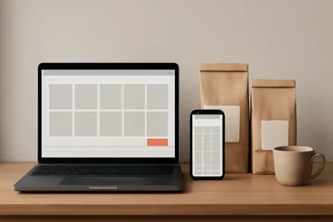
Concept project, not client work. The brand is fictional and the goals below are targets we designed to, not results.
A fictional roaster in Vilnius sells beans in person and wants to sell them online. The challenge: make a small catalogue feel considered, and keep ordering to two steps.
Start from the product: one page per coffee with origin, roast and a plain tasting note. A bag-size selector that never hides the price. Checkout shortened to what a delivery needs. A simple identity of one mark and two colours so the packaging and the store match.
Product page loads fast on a phone. Add to basket in one tap. Guest checkout. Accessible contrast on every label. Lithuanian and English versions.
One display face for names, one text face for notes. Coffee names are the picture.
Product first. Filters only where there are more than a handful of options.
Lithuanian first, English second, with each written natively.
Images sized to the screen. No sliders on the product page.